This Compose Yourself Photo Challenge (CCY) Theme is #17 Complimentary/Harmonious Colors and will be open for two weeks.
 For your assignment I would like to see at least 4-6 photos showing complimentary photos and which colors each photo represents . Please describe what you learned in this lesson as well.
Each week I will select several features from everyone who submits an entry. And from those posts that I feature, I will grant one blogger the Gold Star Award. To find out who was awarded the Gold Star Award and Features for this week, please see CCY Features Week #16 Color Basics.
Note: Participants who do not have at least 6 photos showing their attempt at this week’s topic in their post will not be featured nor be considered for the Gold Star Award.
Essay
This week I will attempt to take more of the mysteries out of color and help you make sense of why your photos work with some colors and don’t work with other colors. If you were to look up “complimentary colors” you are likely to get an array of various color combinations. Color theory just seems to keep getting more and more complex.
In this series I’m really showing you two forms of color combinations. This time we’ll talk about complimentary colors, or harmonious colors, that are adjacent to each other on the color wheel. Next time I will address contrasting colors, which are opposite to each other on the color wheel.
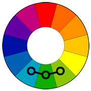
Notice the chain on the bottom they are consider complimentary and are harmonious.
Complimentary color schemes use colors that are next to each other on the color wheel. They usually match well and create a more serene photo. You can use only two or three colors as long as they are next to each other on the color wheel.
Because I usually take my photos outside in nature, it wasn’t easy to illustrate this for you using my own photos, but I hope that I’ve found some to show my point.
Why should this be important to you as a photographer? Sometimes it can help you decide on how to crop or process a picture. It can help you choose what to keep in or take out to create the “feel” of the photo that you would like to give your viewer.
The other way this information can help you is in setting up a photo. For example, if you are do taking pictures of people outdoors, think about the color of their clothes versus the background you’ll have them against.
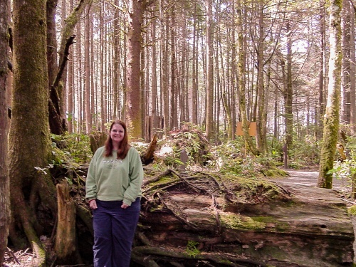
A few things to note if you want the people in your photo to blend in with their surroundings, think ahead to where you are photographing them, then ask them to wear complimentary colors. Greens, khaki, tans, and browns are more likely to blend in with wooded surroundings. That creates a more natural looking photograph but it might not show the person off the best.
Chris took this photo of me in 2006 with a small Sony Digital camera. I just happened to be wearing an outfit that worked well with where I am standing in this photo. I’m beside a tall tree, with a fallen old growth tree behind me. That makes my pants blend in well with the darker background. My sweatshirt happened to be green which matched the moss and lichen around me. And my hair just happened to fit the color and shape of the trees in the background.
 Now if you are wanting the people to stand out from the background, white or black usually works. Bright reds, oranges, and purples work well, too, for most outdoors photos. Unless of course you are in a red tulip field or something.
The point is to do a little planning to create the shot you want. It’s as true of color as it is of perspective, placement of lines, or any other principle we’ve been discussing.
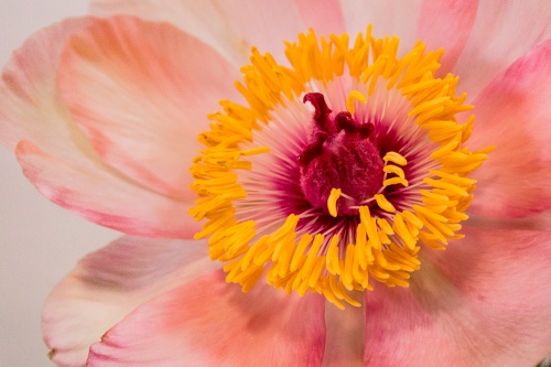
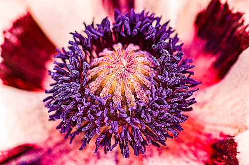
Here are just some examples of complimentary colors. This should give you an idea of what I am looking for.
Purples and Reds
Dark Pink and Orange
Blue, Teal and Green
Orange and Pinks
Greens and blues.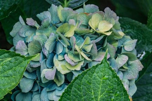
Pinks and orange.
Blue, teal and green Red and Purple
Upcoming Challenges
- #18 Contrasting Colors (starts 2nd Wednesday of March)
- #19 Geometry (starts 4th Wednesday of March)
- #20 Balance (starts 2nd Wednesday of April)
- #21 Guide the Viewer (starts 4th Wednesday of April)
Qi (energy) hugs
Cee


Here is my contribution to Complimentary Colors. I learned alot while studying my photos,
http://musinwithsusan.com/2016/03/06/cees-compose-yourself-photo-challenge-17-complimentary-colors/ between complimentary and contrasting colors.
LikeLike
Very nice and thanks a lot:)
https://mukhamani.wordpress.com/2016/03/04/cees-compose-yourself-photo-challenge-17-complimentaryharmonious-colors/
LikeLike
I really am grateful that you moved these compose yourself challenges to every 2 weeks. It gives me a bit more time to scour through my archives to find something suitable. Thank you for the challenge Cee. https://125mileradius.wordpress.com/2016/03/04/complimentaryharmonious-colors/
LikeLike
I needed the break in writing them as well. It takes some effort. Glad you like the every two weeks.
LikeLiked by 1 person
It does Cee. I admire your willingness to keep at it. And I rally appreciate all that I am learning. It’s too much fun. Enjoy your weekend 😊
LikeLike
http://christiandequita.com/2016/03/03/blush-ccy/
LikeLike
Okay, posting it in the right place!
sorry!
https://ramblingsfromthedarkness.wordpress.com/2016/03/02/cees-compose-yourself-photo-challenge-17-complimentaryharmonious-colors/
LikeLike
Regardless of the spelling I could only find that complementary colours are opposite on the colour wheel. This is what I’ve been taught and have been teaching in my art and colour classes for decades. The colours you described are called analogous colours. I’d love to participate in this challenge but I can’t mislead or confuse my students. http://www.tigercolor.com/color-lab/color-theory/color-harmonies.htm
LikeLike
I did actually look at that sight you pulled up. That has more than what I want to teach. I am not teaching color theory for designers, advertisers, or decorators. I’m using more photographic terms than design. Contrasting is one warm color and one cool color the more opposite on the wheel they are the more contrast. You can still look up contrasting colors for photography and it gives you slightly different views. I totally respect your choice. Go with your gut that’s all I can say.
LikeLiked by 1 person
great post, lovely examples too………here is mine https://juliepowell2014.wordpress.com/2016/02/25/cees-compose-yourself-challenge-complementary-colours
LikeLike
A good lesson . I had forgotten about the colors.
LikeLike
Thanks Bettylouise. 😀
LikeLike
Beautiful examples! They all have a very harmonious feel to them. I never thought about color in this way in photography but I’m betting my archives have more complementary colors than contrasting. It will be interesting to see!
LikeLike
I actually have a lot more contrasting, but then I am really into constrasting and vidid colors …. overall.
LikeLike
I think those are perfect examples to illustrate your point. I’ll take part. Look forward to seeing all the great shots people put out. 🙂
LikeLike
There has been some great entries so far. I can’t wait to see your entry.
LikeLiked by 1 person
I’m getting it together. I’ll likely post it tomorrow. 😃
LikeLike
I love the purple stamens of the poppy against the petals. Lovely!
LikeLike
Thanks for your comment.
LikeLike
Wonderful complementing colours in these photos. Looks like an interesting challenge.
LikeLike
I’m enjoying everyone entries so far. Looks like it is fun for others.
LikeLiked by 1 person
When planning for this challenge I found conflicting definitions of complimentary colors. Your tutorial educated me. Thank you.
LikeLike
Most tutorials are now for blending colors for decorating. Photography is slightly different. That is why I kind of still stick with the old fashioned terms.
LikeLike
Here is my contribution to this week’s topic: The Photos with Complementary Colors | From Hiding to Blogging
https://cxianliu.wordpress.com/2016/02/24/the-photos-with-complementary-colors/
Enjoy!
LikeLike