This Compose Yourself Photo Challenge (CCY) Theme is #23 Black and White: The Basics and this challenge will be open through July 28, 2016.
 For your assignment I would like to see at least 4-6 photos showing the compositional rules listed in the essay. Please tell us what rules you used in your photos.
Each week I will select up to three bloggers the Gold Star Award. To find out who was awarded the Gold Star Award this period, please see CCY Gold Star Award Winners #22 Guide the Viewer and Flipping Photos.
Essay
I have decided to breakdown the topic of black and white into two different lessons. This first essay will concentrate on what type of compositional things to look for when you are considering using black and white. These includes photos you have already in your archives as well as future photos you will take.
Next month’s essay will cover post-processing techniques will be help you make your blacks and whites look more dramatic.
The biggest thing benefit of black and white is that your viewer will actually see more of the details of your photography. The viewer doesn’t get caught up in the color. Here are some things to consider looking for when you take a photo to turn into black and white.
Always Shoot in Color
If you have any kind of post-processing software, don’t let your camera decide how to create your black and white photos. Your camera, especially if it doesn’t shoot RAW formatting, takes out all the color and turns everything into shades of gray, and that really limits your post processing choices. If you think you would like to try black and white, shoot in color and then change it during post processing. That will give you all the data your camera collected for you to play with. (See more at the bottom of this essay about shooting in RAW versus JPEG formats.)
What Makes a Great Black and White Photo
- Texture
- Contrast
Texture
To make the details of your photos really stand out, look for texture. Make sure that texture is not directly in the sun or you will lose details. Look at the lines and determine if they are a contrast in color to the rest of your photo. Same with shadows and shapes.
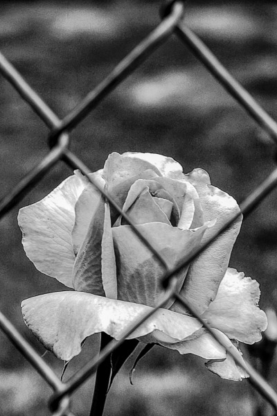
With this rose photo, you see the darker lines and hardness of the metal chainlink fence. Notice you see quickly through the fence to find the familiar shape of a rose. The hardness and regularity of the fence is in contrast to the curving lines of the flower.
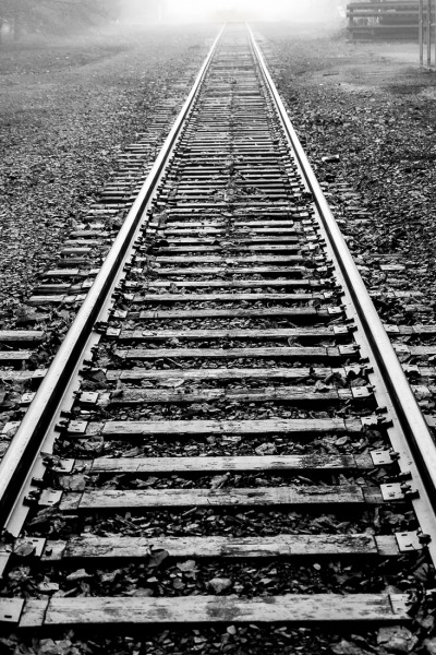
The lines in the railroad tracks have a lot of texture. The rails themselves stand out because they are so bright and breaks up the texture of the gravel beside the tracks.
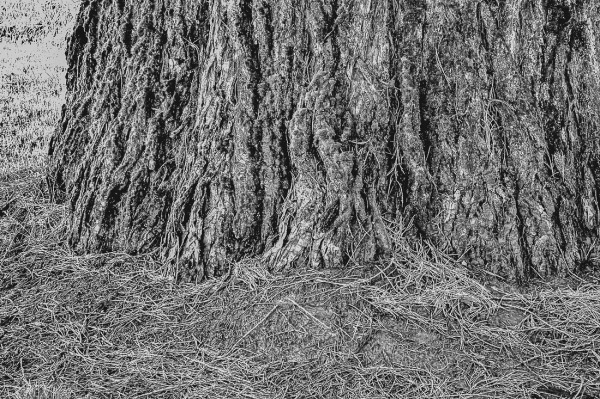
I tried converting this tree trunk into a black and white because it had lots of texture. As you can see, it doesn’t work. Why? Because there is no distinct lines, shadows or shapes that guide your eye.
Contrast
Another things that works real well in black and white photo is contrast. Contrast can be demonstrated by a specific area of smooth and a specific area of roughness, by light and dark. These clouds were so beautiful and show the contrast wonderfully well.

The contrast in this photo is in the tones of gray and black. You have some real dark and some real light gray. With the light background, the shadow really stands out. Can’t you imagine what that old camera would feel like in your hands? What about the porcelain face of the clown? Can’t you just feel how smooth that is?

In the next pair of photos, a lot of color and light contrasts make this photo much better in black and white than its color counterpart. Once again, the details really pop because of the sharper contrast between black and white. The color photo has too many different colors and it can be distracting to the viewer.


This pair of irises illustrate when a photo doesn’t do well in black and white. In this case, using a photo with lots of color contrasts doesn’t work. You lose definition in black and white.


RAW vs. JPEG Formating
 Here is a quick demonstration of the differences between taking photo in RAW and JPEG.
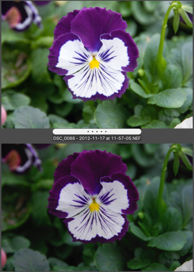
In the pansy photos to the right, the top photo is RAW and the bottom is JPEG as it came out of my camera. I used to have my camera download both JPEG and RAW formats. If you just look at the two photos it appears if RAW doesn’t have the same color qualities of JPEG. When in fact it is exactly the opposite.
When taking photos as a JPEG your camera actually makes a lot of calculations as to what colors it thinks it is seeing. Then your camera throws out all the other data. That is also why JPEG photos take up about half the space as RAW. RAW gives you much greater range when you are using any post processing software because it retains all the data that your camera gathered. You have a lot more to play with, so if you use any type of post-processing software, RAW is the best choice of photo format.
Next, time I will show you some post-processing techniques for black and white photos.
Qi (energy) hugs
Cee


This was an awesome lesson! I especially like the chain link fence with the curves of the flower. I’ve never thought of black and white photography like that. Thank you
LikeLike
Black and white can be quite fun. It’s interesting to see what works in black and white and what doesn’t work. Thanks for commenting,
LikeLiked by 1 person
Thank you for having all these challenges. It is opening my world as a hobbyist photographer!
LikeLiked by 1 person
Thank you for sharing your black and white photo knowledge! I’m always amazed that you take so many photos that work so well in black and white. I hope to start getting out for some photo walks again so I can participate.
LikeLike
Oh I would to have to participate more often, but I know it is difficult for you. 😀
LikeLike
Thank you for hosting this challenge, Cee! Appreciate your guidance on BnW. Here is my entry: http://wp.me/pSlDL-dM4
LikeLike
Cee, here is my entry for this week, greetings Joe https://joesfotowelten.wordpress.com/2016/07/13/sw-bw-series%ef%bb%bf/
LikeLike
Great lesson, Cee. I appreciate you included some photos that don’t work in B&W. I think it’s those that really help me to understand the details. Thanks.
LikeLike
I’m glad that really helped having some “not so good” conversions. Thanks Helen. 😀
LikeLiked by 1 person
Here is my study in contrasts. I never was that much interested in black and white photography but this has changed since I started taking part in your Black & White challenge. I really enjoy it now and like to play around with some photos. BTW: I hate that every pun with “shades of grey” cannot be used anymore without sounding corny. https://picturesimperfectblog.wordpress.com/2016/06/24/contrasts-in-light-and-texture/
LikeLike
Your photos were beautiful. I know I started my Black & White challenge because I needed to practice. I’m glad you enjoy that challenge as well.
LikeLiked by 1 person
I really do. Thanks for all your tips and your encouragement.
LikeLike
Hi Cee, your photo of the rose and the fence is really eye catching.I love black and white photography and found your post very informative. Here is my contribution http://wp.me/p2BDQm-2hU
LikeLike
I can tell you had a lot of fun with this challenge. Keep up the good work. 😀
LikeLike
Another fun and educational challenge. Keep them coming.
LikeLike
I’ll definitely try. Thanks Gayle. Loved your entry.
LikeLike
Cee, nice examples. Here is my contribution for your challenge: https://joesfotowelten.wordpress.com/2016/06/23/sw-fotografie-bw-the-basics/
LikeLike
Very informative post! I love those clouds. ❤
LikeLike
Hi Laura, those clouds were fun to capture. Glad you like my post.
LikeLiked by 1 person
Nice lesson. Now I see why creating a BW photo is not easy as it looks. Thank you…
LikeLike
There is a little technique, but if you just practice is becomes easy.
LikeLiked by 1 person
Great lesson. Thank you!
LikeLike
Thanks so much Susi, glad you liked this lesson.
LikeLike
Your explanations are really helpful to clueless people like myself who only just start to dabble in photography! I spent a lifetime thinking that taking a picture was all about trying to cram the real world into the camera and only realised a couple of months ago (when I decided to do the Photo101 course) that that’s not what photography is about…
On the subject of black & white I’ve done a post about a month ago turning photos I took on a recent trip to Venice into black & white as an experiment (and then throwing most of them out as they didn’t seem to work). I’m not sure if we’re allowed to enter an old post for your challenge but in case we are:
Venice in Black & White
I’d love to have another go at black & white though so if I can fit into my life, I’m going to do another post this week too…
LikeLiked by 1 person
Don’t forget that this challenge is open from now until July 28th. So you have a plenty of time to do a second post. Actually photography is all about telling the story of what you see. I’m off to look at your entry now. Happy snapping.
LikeLike
I thought it was only open till next Wednesday… I obviously wasn’t reading carefully enough. It’s been a hard long day, sorry. 🙂
LikeLike
😀
LikeLike
Thank you for the lesson, Cee! These are great images for us to learn from. 🙂
LikeLike
Hi Amy, I’m glad you liked this lesson. 😀
LikeLike
Beautiful photos Cee I love the Iris one and the train-tracks… here are my submissions for this challenge http://ryanphotography.uk/2016/06/22/cees-compose-yourself-challenge-23-black-and-white-the-basics/ Have a great week Cee and thank you for hosting this challenge. xx
LikeLike
You are so very welcome. You have a wonderful entry for this month. 😀
LikeLike