Here is my entry for Robyn’s One Four Challenge for January Weeks 1 and 2. Okay so I started late, but I thought this will help stretch my creativity. I tend to see the photo I want when I look through my camera, so I work to get that one nice photo. This practice about making 4 photos out of one will give me a good stretch. I’ve been watching everyone participate and I finally decided to try and play along.
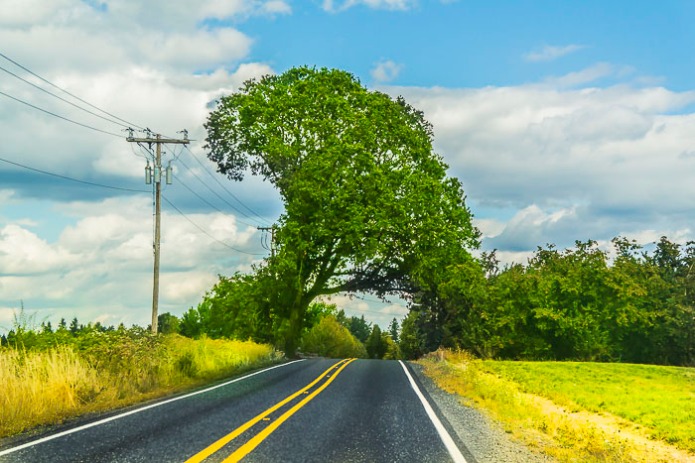
Here is the original photo. I liked how this tree over hung on the road.

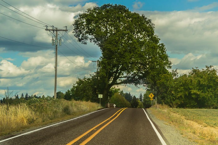
Here is my Week 2 version.
In this one, I took out the cropped it so there was more of the blue in the sky showing. I deleted the signs along the side of the road. Darkened the road to make it standout. Then I added a lighter green to the grass and tree and brightened it up a bit.
Here is Week 1 version.
I cropped this a little closer than the original photo. In this version I keep the exposure a little darker to give more of a sense of darker cloudy skies. Added a little yellow to green.
Until next week.
Qi (energy) hugs,
Cee


Taking the signs out really cleans up the image, good one. I also like the extra sky above the tree giving a feeling of space. Looking forward to next weeks edit Cee.
LikeLike
Thanks so much for your comment 🙂
LikeLike
Great image Cee. I like the colours and tones of the week one edit with the yellow lines leading into the picture. I like the yellow sign with the walking man on it, the colours echoes the yellow lines. You’re right, its different looking for four images rather than just the one. Looking forward to week 3!
LikeLike
Thanks for your comments Katie. 🙂
LikeLiked by 1 person
This challenge is very interesting, so you can see what you can do from a picture. For my taste, the colours of week two are too saturated. I don’t really like it. But I love what you did with the clouds in the week 1 version. I’m curious about week 3 and 4. Maybe at the end you can make a poll and see what’s the favourite of everyone 🙂
LikeLike
That’s an idea about the poll at the end. So far between the two I think it is about tie. Thanks 🙂
LikeLiked by 1 person
I really like the vibrance in this shoot. Nice strong bold colours complimented by the composition.
LikeLike
Thanks Ben. 🙂
LikeLike
It’s great to see how one photo can look so different. It looks like a beautiful summer’s day in this week’s photo 🙂
LikeLike
Thanks for commenting 🙂
LikeLike
Terrific. This week’s version talks to me. The colors draw our attention along the road and over the crest of the hill, and we really want to know where the road is headed. The colors are bright and yet a little unsettled, so the image has an air of mystery about it. It’s not a static image but very dynamic. Exciting. Good work.
LikeLike
Hi Joanne, thanks so much for your wonderful comment and observations! 🙂
LikeLike
Great sky in week 2, Cee, but I like the darker tone of week 1 too… Looking forward to the next two versions.
LikeLike
Thanks for commenting Anita.
LikeLike
I like what you did in week two. No signs. Yup. I like that. I am always amazed when people say they take things out of pictures. I don’t know the first thing about photo programs that do that – if that’s what they are. I am in awe. 😊
LikeLike
Oh I’m not very good at taking things out. I’m just a baby student when it comes to that. 🙂 Thanks.
LikeLiked by 1 person
I like the signs in the photo of your first edit and I like the brighter colors in the second!
LikeLike
Thanks for your input. Glad you like these photos.
LikeLike
Great job with removing the signs and stuff 🙂 The enhanced green and yellow on my monitors is really really really bright tho and while its been a while, my monitors were calibrated with a Spyder 4. That ultra bright look might have been what you were after in which case, OK.
LikeLike
Colors really depend on monitors. I’ve lowed the brightness of my monitor to match my printing to closer to what is on my computer. The colors were spot on just not as bright. I feared all my stuff in the past might have been to dark for a lot of peoples monitors if they didn’t have them turned up as high I did. Plus monitors and screen are so different. I have a new mac laptop so it is new and crystal clear and sharp. Thanks for commenting.
LikeLike
Welcome Cee. I like your week1 version best, with its more natural and muted tones, but look forward to see where that roads leads us! Chris
LikeLike
Hi Chris, thanks for your input. 🙂
LikeLike
Cool tree..i like the bright colours in week 2
LikeLike
Thanks for commenting 🙂
LikeLike
Hello Cee and welcome to the One Four Challenge – so glad you’re joining us 😀
I like your chosen image – and I really like your first two edits.
I get a feeling of modern with week 2 with it’s fresh bright colours and a retro feel with week 2 with it’s more muted tones and darker sky.
Very different moods for both and a great start to January 🙂 Wishing you lots of fun and experiments along the way.
Robyn x
LikeLike
Thanks Robyn. I’ve been watching this challenge for a couple of months and found it intriguing. 🙂
LikeLike
Glad you found the idea intriguing Cee – its certainly a challenge, fun and a great learning experience 😀
LikeLike
I like the warmer tones of week 1 and I like the idea of the road coming to a rise- where is it going to go from there!!?
LikeLike
Thanks for commenting. I like your feed back.
LikeLike
What a lovely road to travel on.
LikeLike
It was a beautiful day for a drive.
LikeLike
Very interesting, Cee. It’s fun to see how the same picture looks so different. Thanks. Helen
LikeLike
I know will do a black and white of it….I’m not sure what the 4th week will be. 🙂
LikeLike