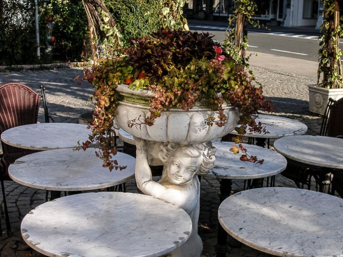
It is the first Friday of he month and that means it is time for ABFriday’s One Photo Focus. That is where everyone who participates and edits the same photo. Each month there is a new photo from one of our regular participants. This week the photo was taken by Loré Dombaj of Snow’s Fissures and Fractures. Here is Loré’s photo that we are all suppose to edit or enhance.
I really like taking part in this challenge, because I get to edit someone’s photo. I get to take a glimpse into the world of how someone else sees. Then I get to create something that I can see. It is a unique and fun experience.

Here is my analysis of Loré’s photo. I really like it the photo. With all the marble top round tables surrounding the statue it makes a very distinct geometric photo. I did not care for the road in the background is to messy. Although taking photos are stores and shops, this is a common occurrence to get stuff (noise) in the photo that you don’t want. I like that Loré left it in because it allowed me to pick where I want to crop the photo without cropping out things that I wanted in the photo.
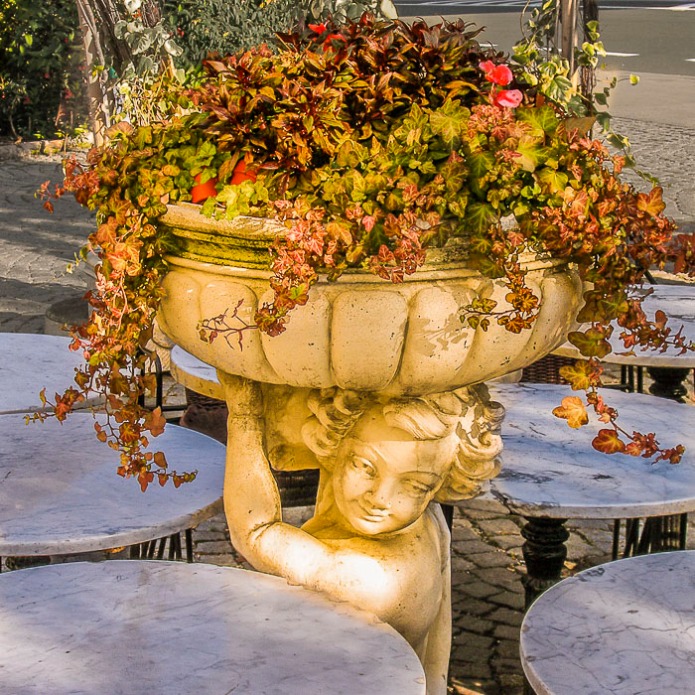
Here are a few of the steps I took to achieve my results. I hope you like what I did with this photo.
- Cropped photo to get rid of most of the road and yet leave enough of the round tables to give the illusion of them being round.
- Instead of a 4×6 (photo standard) sized photo I used a square. It plays with the geometric shapes.
- I unsaturated the background noise: remaining street and bushes and trees in the background.
- Then I added a desaturated blue (making it more gray) on the table tops. I wanted a contrast to the statue.
- Then I added a reddish-orange layer over the statue to pull out a different but still acceptable coloring. It also blended in with the plants that were planted on the top.
- Added a little yellow layer to the plants to have it appear as if the sun was shining just a little brighter on the plants.

Qi (energy) hugs
Cee


Cee, great way to use color to draw our eyes! I have to remember that desaturating is a wonderful alternative to blurring. I also really like the warmth of the statue and the coolness of the tables. Great lovely contrast and final image! Looking forward to seeing what you come up with us next month 😀
LikeLike
Thanks Stacy. You host such a great challenge. I enjoy this every month. 🙂
LikeLike
I like the way you explain your changes and why! You really achieved what you set out to do. Great job!
LikeLike
Thanks Emilio. 🙂
LikeLike
Lovely edit, I really like your square crop.
LikeLike
Thanks so much for volunteering to have all of us play with your photo. Thanks so much for commenting.
LikeLiked by 1 person
Nicely done. Your idea of going with a desaturated blue on the table tops was very creative and the desaturation of the street details was a great way to make them almost disappear without cropping the image was also a nice touch.
LikeLike
Hi Robin, thanks so much for commenting. 🙂
LikeLike
Except for the yellow tint, our results and processes were nearly identical. I like your cloning out of the sign better than mine.
That yellow tint to warm it up is an interesting idea. I didn’t do anything with warm tones, I went for the blues instead.
Great job interpreting it! I’m so glad you got me hooked into this.
Nancy
LikeLike
Isn’t this just the best challenge. I love to see how everyone edits these photos. I’m up next month and I have no clue what to use as a photo… Any ideas?
LikeLiked by 1 person
I was going to suggest this, but the ABFriday crowd has a bunch of comments in it already!
https://ceenphotography.com/2014/10/10/cees-tips-and-tricks-photo-edit-walkthrough-of-soft-pastel-tulips/
LikeLike
How about the arbor in this one?
https://ceenphotography.com/2015/03/01/cees-odd-ball-photo-challenge-2015-week-9/
LikeLike
Or the pop can at the bottom.
https://ceenphotography.com/2015/02/08/cees-odd-ball-photo-challenge-2015-week-6/
LikeLike
You have some wonderful ideas. I might go with the arbor…..I cropped it so it has the entire house in it too. The can might be interesting as well. You have given me some ideas to think about….thanks so much!!
LikeLiked by 1 person
You’re welcome!
LikeLike
Great use of layers to create contrast with the colours, it gives a really nice overall tone to the image. I like the square crop, its not something I had thought of, it works really well. 🙂
LikeLike
Thanks Katie, I’m glad you like what I did. 🙂
LikeLiked by 1 person
Very nice work. I like yours better than the original.
LikeLike
Thanks Sandra. 🙂
LikeLike
I like that you gave the statue a different hue than the rest of the photo. Cropping it makes a big difference too! Looking at all these before and after shots makes me realize I need to learn TONS about processing 🙂
LikeLike
All in due time. You will pick it up. I suggest just start by learning one little thing a week. And really learn it. That way you are more likely not to forget. I tend to try to learn too much at once and can’t remember a thing I did. 🙂
LikeLiked by 1 person
Lol…me too! My brain goes on overload! I’m starting a one on one photography class tomorrow so I’m sure that will help.
LikeLike
The warmth you brought to the image is very nice. Did you do your work in PS, LR or both? Or another app? I’m thinking since your talking of layers it’s PS.
LikeLike
PS Bridge. I usually only use photoshop if I want fancy stuff. Thanks. 🙂
LikeLike
I like the warm sunlight you have added to the statue. it is always lovely to see your work.
LikeLike
Thanks so much for your remarkable comment!!! Have a great weekend.
LikeLike
Lovely edit Cee. I like the square crop and I love the warm feeling you’ve created.
LikeLike
Ahhh thanks so much for your comment 🙂
LikeLiked by 1 person
I like the idea of a different warmer coloured stone for the statue, nice concept 🙂
LikeLike
Thanks so much for your comment. 🙂
LikeLike
I love your editing of this. The centre piece really pops out of the image.
LikeLike
I’m glad you like what I did with this photo. 🙂
LikeLiked by 1 person
I really like the warmth of the statue, it gives the feeling that the sun is spot lighting it in the frame. Beautiful work.
LikeLike
Hi Ben, thanks so much for your feedback. Glad you like my edit. 🙂
LikeLiked by 1 person
Well done Cee… me too crop in square !
Ciao ciao
Max
LikeLike
I enjoyed your edits too. Thanks Max. Have a great weekend.
LikeLiked by 1 person
you too Cee… Ciao ciao
LikeLike
looks great – great colour enhancement and focus
LikeLike
Thanks for your comment. 🙂
LikeLike
Very good edits. I like the warmth you created.
LikeLike
Thanks Mary! 🙂
LikeLike
It look warmer! I like your version
LikeLike
Thanks so much for commenting 🙂
LikeLike