This Compose Yourself Photo Challenge (CCY) Theme is #18 Contrasting Colors and will be open for two weeks.
 For your assignment I would like to see at least 4-6 photos showing contrasting photos and which colors each photo represents. Please describe what you learned in this lesson as well.
Each week I will select several features from everyone who submits an entry. And from those posts that I feature, I will grant one blogger the Gold Star Award. To find out who was awarded the Gold Star Award and Features for this week, please see CCY Features Week #17 Complementary/Harmonious Colors.
Note: Participants who do not have at least 6 photos showing their attempt at this week’s topic in their post will not be featured nor be considered for the Gold Star Award.
Essay
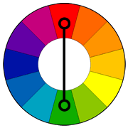 This is our final week where I will discuss photographic color tips for composition. This time I’ll talk about contrasting colors, those that are opposite to each other on the color wheel.
You can see on the chart (to the right), the colors that I refer to as contrasting are opposite. These colors pop with each other. These color combinations will also have one cool and one warm color. Remember the saying that opposites attract? I believe they do, and in that attraction make a strong statement.
The most popular combinations are:

Mexican Flag
Red and Green
- Christmas Colors
- Logos: 7 Eleven logo, Papa John’s, Quizno’s Sub sandwiches
- Flag colors: Mexico, Morocco, United Arab Emirates, Italy

Blue and Orange
- Sports team colors, Football-Denver Broncos, Hockey-Anaheim Ducks, Baseball-NY Mets
- TV shows and movies often have a theme color such as NCIS’ famous orange wall with the dark blue accent color
- Posters, especially for movies and TV shows

Minions
Purple and Yellow
- Sports Teams – Basketball-LA Lakers
- Amusement Park Rides – Rollercoasters
- Kids toys
- Clothing
Because I usually take my photos outside in nature, it wasn’t easy to illustrate this for you using my own photos, but I hope that I’ve found some to illustrate my point.
Why should this be important to you as a photographer? If you like vivid colors that pop, you will want to make sure you have one cool and one warm color in any picture you compose. An example might be if you are doing portrait work and you really want your subject to stand out, make sure that the person is wearing the opposite color as the background. If you are shooting food, make sure your background contrasts with the primary color of your food. Things like that.
The point is to do a little planning to create the shot you want. It’s as true of color as it is of perspective, placement of lines, or any other principle we’ve been discussing.
In Review
Color theory for photography is really quite basic. Here is a recap of what we learned in this series.
- The Color Wheel.
- The colors that are considered warm (reds, oranges, yellows, lime greens) and cool (greens, teals, blues, purples).
- The colors that are harmonious with each other or match closely with each other. Colors are next to each other on the color wheel.
- The colors that are considered to be contrasting because they are exactly opposite on the color wheel and bring out the differences.
If you want to find out about more about color in general for matching clothing, designs, graphic art, you may want to study up on color theory. It is much more complex than that of color for photography.
Photo Examples
Here are just some examples of contrasting colors. This should give you an idea of what I am looking for.

Red house with green roof.

Blue and orange

Yellow and purple

Red and Green

Orange and blue

Purple and yellow
Upcoming Challenges
- #19 Geometry (starts 4th Wednesday of March)
- #20 Balance (starts 2nd Wednesday of April)
- #21 Guide the Viewer (starts 4th Wednesday of April)
- #22 Brightest Spot (starts 2nd Wednesday of May)
Qi (energy) hugs
Cee


These are all wonderful… I especially like the orange and blue and purple and yellow. One question. Why are black, gray and white not on the color wheel? Are they not considered colors? I somehow missed this prompt earlier. May I turn my homework in late, teacher??? Will I receive demerits?
LikeLike
No I never give out demerits and therefore you can never be too late to my class 😀
Honestly I don’t know why black and white aren’t considered colors. But I do have my thoughts. All colors in their lightest hues are white and same for black on the darkest hues. I know some people consider the dark end of blue to be black.
Plus for photography monochromatic (black and white) is a whole different type and style. Which I will eventually cover in this series of challenges. I just thought we needed a break from colors.
So this is my answer to your question.
LikeLike
http://christiandequita.com/2016/03/19/retrospect-ccy/
LikeLike
Beautiful and thank you:)
https://mukhamani.wordpress.com/2016/03/19/cees-compose-yourself-photo-challenge-18-contrasting-colors/
LikeLike
I love using contrasting colours red/green, purple/yellow, blue/orange, makes for dramatic pictures in both painting and photography…those orange flowers on a blue background are stunning…
LikeLike
The blue was the color of my office walls. Thanks Jim for commenting. 😀
LikeLiked by 1 person
love your examples, those 2 yellow and purple flowers are just gorgeous!
LikeLike
Thanks Capt. Jill. 😀
LikeLike
Brave choice by the homeowner. And the leaves and berries demonstrate the topic perfectly.
Joining from https://venturesinphotos.wordpress.com/2016/03/09/photo-challenge-contrasting-colors/
LikeLike
Having no art background (or talent), I don’t think much about colors. But this opposite color thing does explain why the colors really pop in a couple of photos I’ve taken in the past. Especially a closeup of red berries and green leaves.
LikeLike
It’s just handing knowing some of this stuff. I don’t usually don’t try and match colors especially for photography, but I do know when a photo will really pop and what makes me really like it. 😀
LikeLike
I’m only getting in on the tailend of this colour-challenge, nevertheless I tried 🙂
https://picturesimperfectblog.wordpress.com/2016/03/09/cees-compose-yourself-18/
LikeLike
Your photos are so vivid Cee
LikeLike
You found wonderful examples – all the colors in your photos really pop! And the center of that lotus = amazing!
LikeLike
Thanks Trisha. 😀
LikeLike
Love your pictures in this post.
LikeLike
Thanks Lena. Glad you like my choices 😀
LikeLiked by 1 person