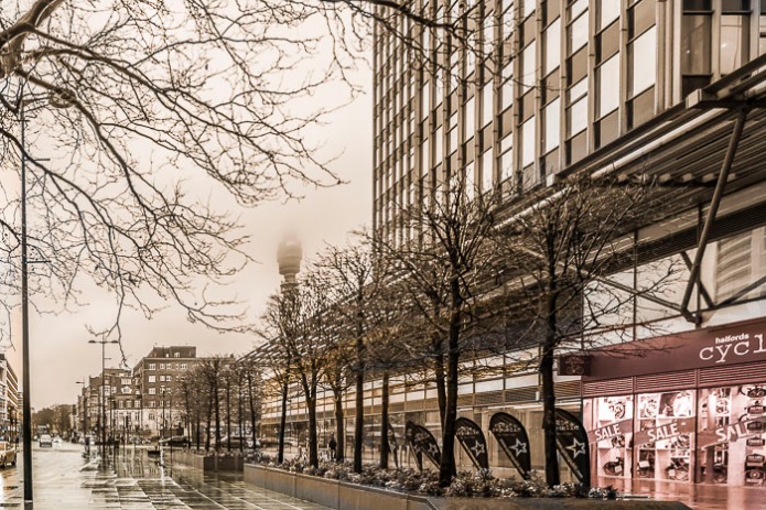
Here is my entry for Visual Venturing’s AB Friday, One Photo Focus for February 6, 2015.
Here is the original photo. This month the photo was taken by Manal Ali of A Single Shutter.

Here are some of the basic steps I took to achieve the look I got.
- Straighten out the edges with my software (Adobe Bridge).
- Turned the photo to black and white. I wasn’t happy, it seemed so cold.
- Added a couple different gradients of orange to make the photo sepia toned. I think it really warmed up the photo.
- I liked that the cycle shopped really stood out in the original photo, so I pained that area with a dark reddish area.
Here is my final edited version.
Qi (energy) hugs
Cee


I love the warmth you achieved, a very nice editing job.
LikeLike
Thanks so much for your comment 🙂
LikeLiked by 1 person
Great job Cee. Love the color tones and how the front soft color carries the eye down the street.
LikeLike
Thanks so much for commenting 🙂
LikeLike
Great job. Cee. I like the warm tone you added. And the clarity is fantastic.
LikeLike
Thanks Emilio. 🙂
LikeLike
That is so awesome! Tell me about Adobe Bridge.
LikeLike
In the latest version of bridge (that comes with photoshop) I can do 95% of my editing in that. It is all non-destructive editing too. So I never have to be concerned about ruining an original photo. I can switch to photoshop if I want to edit. It is a basically the same as Lightroom but not quite as powerful. But then with Photoshop, I have more than lightroom can give. Contact me if you need or want to talk further on this subject.
LikeLike
I loved the effect, especially going with sepia but coloring back into the foreground like that. The pictures were all so different! I love to see all the creativity.
Nancy
LikeLike
Oh yeah, I adore seeing how people changed this photo. I really liked your work this week. 🙂
LikeLiked by 1 person
Thank you!
LikeLike
I love the sepia tone, when I saw it the first thing I thought is “I should have done that for my image”. Really nice job, Im ok about the red tone in the cycle shop, but on my monitor its a lot brighter than the rest of the image and that is a bit out of kilter 🙂
LikeLike
I know stuff like that all depends on your monitor. Thanks for commenting.
LikeLike
Funny. That’s JUST what I was doing today with some photos shot wide angle in a concert hall in relatively low light. Everything but the shine on the road. Great work!! And it looks like an old film noir.
LikeLike
Hi Marilyn, thanks for commenting 🙂
LikeLike
This is so good. I love the sepia tone, you’re right, it really warms it up, great idea!
LikeLike
Thanks for your comment and for stopping by 🙂
LikeLiked by 1 person
Lovely work.
LikeLike
So glad you like what I did.
LikeLike
Nice effect with the sepia toning, it really warms the image up. 🙂
LikeLike
Thanks Katie.
LikeLiked by 1 person
Cee, it’s so interesting to see this as sepia-toned. I don’t know why I personally steer away from that towards B&W, but I like how it works here. And a creative touch to the cycle shop 🙂 Great, fun edit (and you didn’t crop but for the straightening 😉). Thanks, as always, for playing along. It’s wonderful to have you!
LikeLike
Nope the only crop I did was the straightening. I know weird. I think I was more concerned about straightening it, I didn’t look at the photo the same way I usually do. I was really stumped on this. There were some marvelous edits on your post today.
LikeLike
I know, right? I now look back at mine and would crop it in a much different way. I was focused too much on the BP Tower and left out the lovely street life on the left. Goes to show the power of a crop 🙂
LikeLike
Going Sepia with the black and white has worked well adding depth to the image. Not sure i’m in on the red on the cycle shop yet that seems to be more my personal taste. Great editing.
LikeLike
I wasn’t sure what to do with that shop. I kept it black and white and then switched it at the last minute. Thanks Ben for commenting 🙂
LikeLike
Very nice monochrome version, Cee.
LikeLike
Thanks Lynne.
LikeLike
I like the sepia tones…
LikeLike
Thanks.
LikeLike
Hmmm. My favorite part of the original image is the arching tree branch. I wonder if it had to be lost when it was straightened?
LikeLike
Yep. That was as big as I could get it after the straightening process. Thanks Carol of commenting.
LikeLike
I watched her very informative video and I get it now I hadn’t even seen the tower. I learn so much from you, thanks.
LikeLike
Gorgeous! Must learn the fine art of post-processing. 🙂
LikeLike
Just be patient with yourself, it will come. 🙂
LikeLiked by 1 person
Great work, Cee. I like your finished photo so much better. I don’t like it when my world is out of kilter so whenever horizons aren’t level or there is lens distortion, I can’t stay with the photo. I stopped following one photographer because he always put his otherwise nice city-scapes at an angle. Your before and after confirms to me my preference. The only exception would be the distortions of a super-wide angle or fisheye lens. That can be intriguing. Ah, the blessing of post processing software.
LikeLike
Yep it was most likely taken with a wide angle lens. I don’t like it either, but I know some people really enjoy the look. 🙂 Thanks Pat.
LikeLike
The end result is quite remarkable, and makes the photograph outstanding. I never knew an odd photo could be straightened out.
LikeLike
It depends on the post processing software you have. I happen to be able to do with a single click. I use Adobe products.
LikeLike
I like the end result!
LikeLike
Thanks Joanne. Happy Friday!
LikeLike
To you too!!
LikeLike