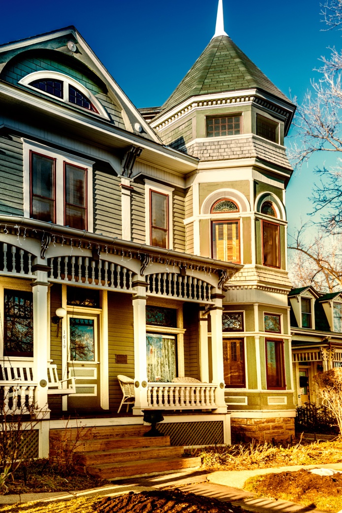
Since it is the one year anniversary for After-Before Friday week challenge, we were all able to edit Stacy’s photo for this week’s ABFriday One Photo Focus (make sure you click on the link to see how everyone edited the Stacy’s photo. I adore this challenge because everyone edits the same photo. It is always interesting to work with someone else’s photo and see what I can discover in their photography. Here is Stacy’s original photo. If any of you recognize this photo, it was the house that was used in the TV Show Mork and Mindy in Boulder, Colorado.

Here is my edited version. As much as I enjoyed the fence in this photo, I decided to crop it out. Then I did some magic in both bridge and Color Efex for this edit. I hope you enjoy my results.
Qi (energy) hugs
Cee


I love older houses with tower rooms!
LikeLike
Yeah, they are nice. 😀
LikeLiked by 1 person
Hi Cee, sorry it has taken so long to comment on your image. Life has been a bit hectic here! I love what you have done – one of my preferred interpretations. The crop brings the focus on the house, the warmer, richer colours, the details it has brought out… Really well done 🙂
LikeLike
Aww thanks so much for your wonderful comment. I’m thrilled you liked my edit! 😀
LikeLike
I do like your edits especially the warm golden effect on the porch
LikeLike
Thanks for your comment. 🙂
LikeLike
You know, why did I not think of cropping out the fence?? I did crop out a bit from the original photo but I still had the feeling that we were a bit too far away from the door. And that’s where my mind stopped. The crop solved that problem (and got rid of the snow in the foreground too). Ah, well, therein lies the fun of 1PF! I’ve never used split toning (though Ben’s tutorials on it are wonderful), but I like seeing what it did for the image! Appropriate for a “Mork” house, Cee 😃 Thanks so much for for your ever-present support of ABF and 1PF!!
LikeLike
I’m glad you like what I did with your photo. It sure was fun playing with it. I liked the fence, but had no idea what to do with it. I think you hit it right on the head, I wanted more of the front door and house. It has been pure fun to take part in your challenges.
LikeLiked by 1 person
😊 Thanks, Cee.
LikeLike
Autum feel, nostalgic. Lovel edit Cee
LikeLike
Thanks. Glad you like my edits.
LikeLiked by 1 person
I like the warmth you have added to the picture, it really adds a new dimension to the image. The contrast also works nicely. Great Editing.
LikeLike
Hi Ben, thanks so much for your comment. Glad you liked my edit.
LikeLike
I really like the fence edited out. I would love to see the inside of that house.
LikeLike
Yeah, especially in the olden days. I wonder if it has been updated at all.
LikeLike
Great retro golden glow happening there!!
LikeLike
I just had to do it for this challenge. I usually don’t do the split colors, but this one screamed for it in my opinion. 🙂
LikeLiked by 1 person
It worked!! 🙂
LikeLike
This definitely has the 70’s feel to it with your colours. Great edit
LikeLike
Thanks Raewyn 🙂
LikeLike
I very much like what you did with it. It not only looks good, it look highly appropriate to the subject matter, a color you might really see on a house of this style and vintage. Beautiful work.
LikeLike
Thanks Marilyn….
LikeLike
Great idea to crop out the fence. Nice tones in your edit too.
LikeLike
Glad you like my edits 🙂 Thanks for commenting.
LikeLike
Love your edit. You back us and the house in the 70′ !
Ciao ciao
Max
LikeLike
Thank Max
LikeLiked by 1 person
I love what you’ve done. When I was in the Midwest, I saw a lot of Victorian homes that were refurbished with vibrant colors. Somehow you have conveyed this in your processing very realistically.
LikeLike
Thanks Emilio. 🙂
LikeLike
I like your edit, Cee – it’s like we’re stepping back into the TV set – I remember Mork and Mindy!
LikeLike
I never did watch Mork and Mindy. I did know them through Happy Days though.
LikeLiked by 1 person
A retro look back to the time of the original series.
LikeLike
Thanks Lynne!! 🙂
LikeLike
Very cool, Cee! I like the two split colors. 🙂
LikeLike
Thanks Amy! 🙂
LikeLike
Beautiful result!
LikeLike
Glad you like my result. Thanks for stopping by for a visit. 🙂 🙂
LikeLiked by 1 person
You are welcome! 🙂
LikeLike
Great job. The slight vintage look is wonderful.
LikeLike
Thanks Mary, I was going for that look.
LikeLike
I like the colours in your edit Cee, they definitely fit with the 1970s sitcom! I think we have virtually the same crop and I agonised over the fence too! 🙂
LikeLike
I was kind going for that 70s look with a little modern twist. We do have the same crop. I liked the fence but at the last minute decided to delete it. I know it took something away, but it also added something too. I like our decision.
LikeLiked by 1 person
Like the first photo the best and what an amazing house.
LikeLike
It is an amazing house.
LikeLike