 Stacy is kicking off her second year of doing After-Before Friday Challenge. I thought I would start out by using a rose and showing how to correct the color red.
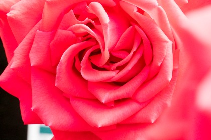
See my original photo to the right. Believe it or not this flower is actually red and was taken in sunlight shining through a greenhouse type roof.
Red to me is one of the hardest colors to photograph outdoors. Red tones usually turns out to be a burnt out magenta with a hint of red that is if the the object is in the sun. It took me many years of trying to get a perfect balance of shade and sun. And then it was results were rarely consistent, it really depends on the tone of the red (light or dark). Then I finally discovered how to fix it in my post processing.
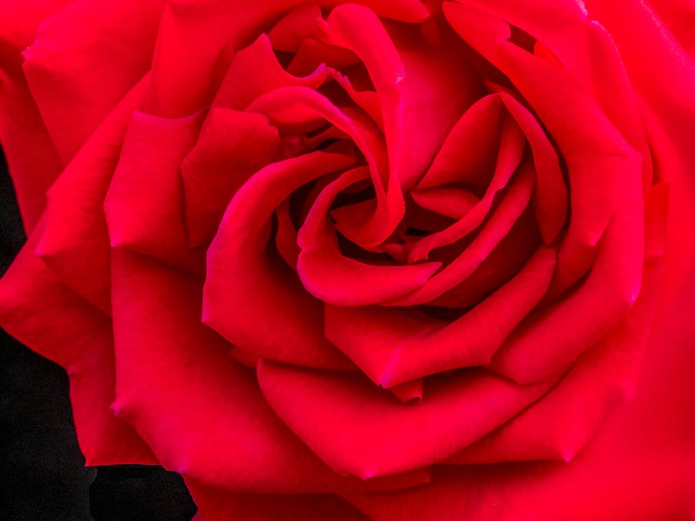
Here is what this rose looks like after processing. I list my some of my processing tips below the rose. This is much closer to the true color of the rose I actually photographed.
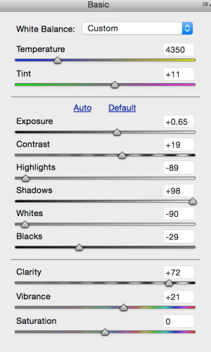
Here are some of my basic steps. I only did some basic post processing in Adobe’s Bridge (fairly equivalent to Lightroom). This photo was taken with my Sony A7ii Camera with 18-200mm lens.
I cropped the photo, I took out the right edge to get rid of some of the bokeh which didn’t appeal to my eye.
This photo was taken in a nursery so I removed some the sign that was noticeable on the bottom left.
 Now for fixing the red.
The best tip is to take the temperature down. Or increase the blues. Depending on what type of software you are using. This will actually darken your photo if it is basically all red, like this one is.
I also added a little pink to add in just a little more red tone.
I kept the exposure and contrast pretty much as they came out of the camera.
Now if you drop down the list I really lowered the highlights (bright tones) and Whites. This gives the red a nice deep tone and took out the remaining bright magentas. This help tremendously with any color that is burnt out.
Black I also darkened because it brought the lines in the rose out more.
 Then I brightened the shadows to bring the red out in the layers of the rose. Otherwise the darker reds would show up more as a black.
Some of my standard corrections are to add clarity, especially with photos that are already in good focus. If you want a softer look, you can always take down the clarity.
Especially with flowers I will add a little vibrance. I chose vibrance rather than saturation, because most post processing software if they have both option, the saturation actually changes the color. Vibrances enhances the color that is presence which results in a more natural looking enhancement.
To view my other Tips and Tricks click here.
Qi (energy) hugs,
Cee


Thanks for the help. Red is a hard one.
LikeLike
You are welcome.
LikeLike
This is a great post because I always have this problem, even indoors and for my shop postings.
LikeLike
Reds can be real tricky. Some are just unrecoverable….but play with the them and you should be able to improve them greatly.
LikeLiked by 1 person
Cee, what a gorgeous red, red rose! Because I don’t typically shoot flowers, I’ve never really encountered the issues you’ve addressed. I mean, yes, I’ve photographed images where red appears, but it never dominates. That being said, your tips are great ones for me to store away and refer to again should I need. Clearly, they work, as the red is certainly jewel-toned on my monitor! Stunning detail and layer upon beautiful layer.
LikeLike
Thanks Stacy. I’m thrilled you liked my rose 😀 Have a great week!
LikeLiked by 1 person
Great how-to, Cee, you really brought out a much more pleasing red. I like that you increased the blacks it really makes the red pop.
LikeLike
Thanks Nic for your comment 😀
LikeLiked by 1 person
I can smell this rose from where I am sitting !! 😀
LikeLike
😀 Thanks. Have a great week!
LikeLike
have a great week yourself !!
LikeLike
The timing of this post is perfect. Recently I’ve experienced this exact problem when photographing red and orange flowers. I’ll give your suggestions a try. Thanks!
LikeLike
Let me know how it goes. Feel free to ask any questions. 😀
LikeLike
Thanks for sharing this detailed post processing knowledge with us Cee. It’s a pretty rose and has turned out lovely with its shades of red and black lines.
I too find it difficult to capture red. It’s very tricky. I’ll try these tips. 🙂
LikeLike
Hi Norma, thanks so much for commenting.
LikeLiked by 1 person
Red is such a hard color to photograph, I tend to cycle through the camera profiles in camera raw to see which camera profile best deals with the red tones in the image. You have done a great job with this rose.
LikeLike
Thanks Ben for your comment.
LikeLike
Nice tutorial Cee. I agree – how many washed up red florals do I have in my archives – I can have a go at them now.
LikeLike
Yep you sure can. May not work for all of them, but should help out a fair number. 😀
LikeLike
Great tips for post! Thanks!
LikeLike
Glad you liked my tips. 😀
LikeLike
Good job of processing
LikeLike
Hi Bettylouise, thanks for commenting.
LikeLiked by 1 person
Beautiful picture Cee. It is really hard to get natural looking reds when they dominate in a picture like this and you’ve done a great job. I will have to note down your technique so I can try it. Thanks for sharing 🙂
LikeLike
You are welcome Katie. 😀
LikeLiked by 1 person
This kind of post is what I like about the ABFriday group. I always learn something from these posts. Thanks very much for the details on you technique. The results are proof positive that it is an excellent approach.
LikeLike
Thanks Robin. 😀
LikeLike
Pretty much what I’ve been doing, depending on the individual picture. It really helps to NOT shoot in full sunshine, too. Shade is much better for these colors.
LikeLike
Oh yeah you need to go with shade of some sort. Bodies help out a lot if none is around. 😀 The deep maroons and jewel tones however are really hard to get in a lot of shade though.
LikeLike
Thank you very much Cee. Very interesting your tips !
Ciao ciao
Max
LikeLike
Glad you like my tips. Feel free to ask me any question. The most I will say is “I don’t know”. 😀
LikeLiked by 1 person
Nicely done !
LikeLike
Hi Laura, thanks for commenting. Glad you like my rose photo.
LikeLike
You are so welcome!
LikeLike
Useful post-processing tips – thanks, Cee.
LikeLike
You are welcome Peggy.
LikeLiked by 1 person
Nice tips, and what a beautiful flower.
LikeLike
Thanks Mary for commenting 😀
LikeLike
Thank you, Cee. From advice you gave me a bit ago, I myself fiddled around with LR and basically have learned what you have showed here. I again thank you for helping me and now helping others! Have a great Friday!!! Love, Amy >3
LikeLike
You are so welcome Amy. Thanks. It saves many a photograph for me. I’m glad I learned it because I was about to give up on red flowers.
LikeLiked by 1 person
LOL Me too …. about giving up on the red and deep orange as well flowers. Right now I have a Rose called Blue Wonder that is a (how can I describe Her?) deep reddish/blue (sort of) color, which I haven’t seen in over 2 years. She opened just yesterday and since then I have been scratching my head, trying to figure out which settings I am going to try in order to get Her color perfect. I know I need Light, and today being overcast, is not a good day to even try. *sighs* Photography really can be challenging, but that is exactly one of the reasons why I LOVE it!!! It pulls my creative juices from out of me!!! Love, Amy ❤
LikeLike
Oh I hope you can nail the photo. The deep jewel colors can be hard to get. I have a real deep purple iris I just can’t quite capture nicely. Maybe lightly cloudy and then pull up the vibrance and exposure. That might be where I would start.
LikeLiked by 1 person
I’ve been trying several different ways, with this one and with another. I won’t stop until I get it. I underexposed with both, one to -2. I nailed the one with my Samsung but that is not a DSLR. These DSLR’s are really tricky with these deep colors. I’m not a quitter. If worse comes, I will post the photo from my Samsung. LOL Have a great weekend, Cee!!! ❤
LikeLike
Ty for sharing.
LikeLike
Thanks for commenting Ruth.
LikeLike